
I used to think St. Patrick’s Day decor meant shamrocks everywhere and loud green banners. There was always that one leprechaun decoration nobody remembered buying.
Then I grew up, calmed down, and found minimalist wall art for subtle St. Patrick’s Day decor. It changed everything. Who says you need to go all out in green to celebrate?
If you love clean spaces but still want to acknowledge the holiday, you’re in the right place. Let’s explore how to style St. Patrick’s Day wall art without making your home feel like a novelty shop.
Why Minimalist Decor Works So Well for St. Patrick’s Day
Minimalism and St. Patrick’s Day sound like opposites, right? One feels calm and intentional, while the other usually comes with glitter and plastic. Yet they work surprisingly well together.
Minimalist decor focuses on suggestion rather than shouting. A soft green print or a clean Celtic symbol says more than twenty clover cutouts.
Ever noticed how one thoughtful piece feels stronger than a wall full of noise?
I learned this the hard way after overdecorating one March and feeling tired just looking at my own walls.
Less Green, More Meaning
You do not need to drown your space in emerald tones to honor the holiday. Subtle choices feel more grown-up and intentional.
Minimalist wall art lets you:
- Celebrate St. Patrick’s Day without visual clutter
- Keep your home calm and balanced
- Transition easily back to everyday decor after March 17
And let’s be honest, nobody wants to redecorate the entire house for a single day.
Choosing the Right Color Palette
Color sets the mood before anything else. For minimalist St. Patrick’s Day decor, the palette matters more than the theme itself.
I always start by limiting myself to two or three colors. Any more than that, and things start feeling busy fast.
Soft Greens Over Loud Emeralds
Bright green has its moment. That moment does not need to happen on your walls.
Instead, look for:
- Sage green
- Muted olive
- Eucalyptus tones
These shades whisper St. Patrick’s Day rather than yelling it. They also blend beautifully with neutral interiors.
Neutral Bases That Ground the Look
Minimalist wall art shines when it rests on a neutral foundation.
I love pairing green accents with:
- Warm white backgrounds
- Soft beige or linen tones
- Light gray for modern spaces
This approach keeps the art seasonal but not gimmicky. Have you ever noticed how neutrals make color feel more intentional?
Shop Minimalist Green Wall Art
Minimalist Symbols That Still Feel Festive
You can embrace St. Patrick’s Day symbols without going full cartoon. The trick lies in abstraction and restraint.
I always ask myself one question before buying or hanging art. Would I keep this up if it were not March?
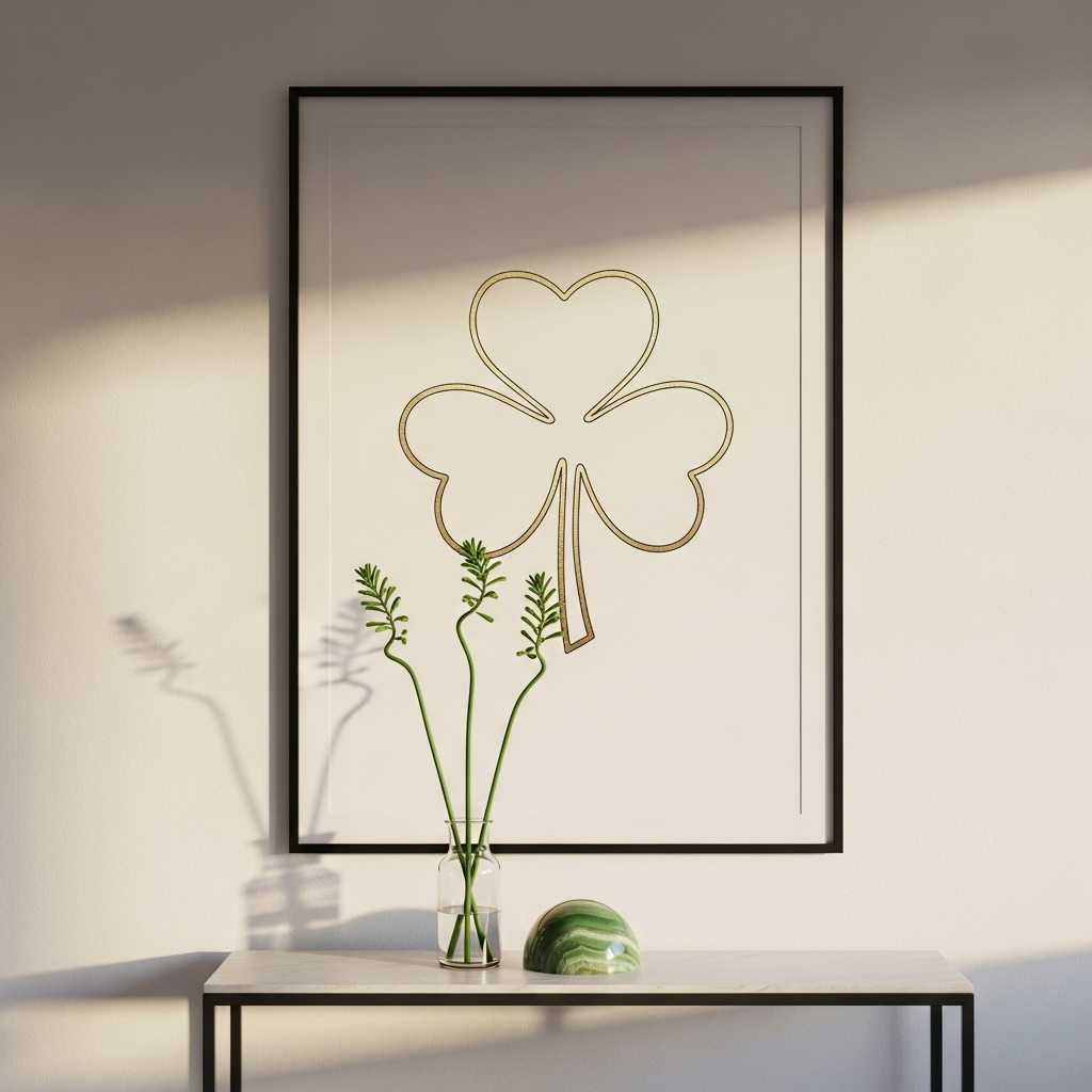
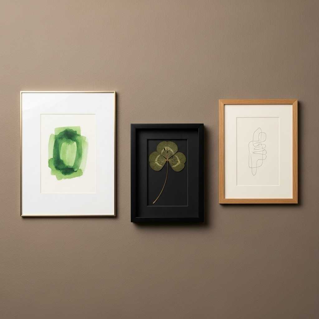
Abstract Shamrocks and Botanical Prints
Shamrocks do not need to look literal. In fact, they look better when they do not.
Great minimalist options include:
- Line-drawn clover illustrations
- Botanical leaf prints that hint at Irish greenery
- Soft watercolor shapes inspired by nature
These pieces feel artistic first and seasonal second. That balance makes all the difference.
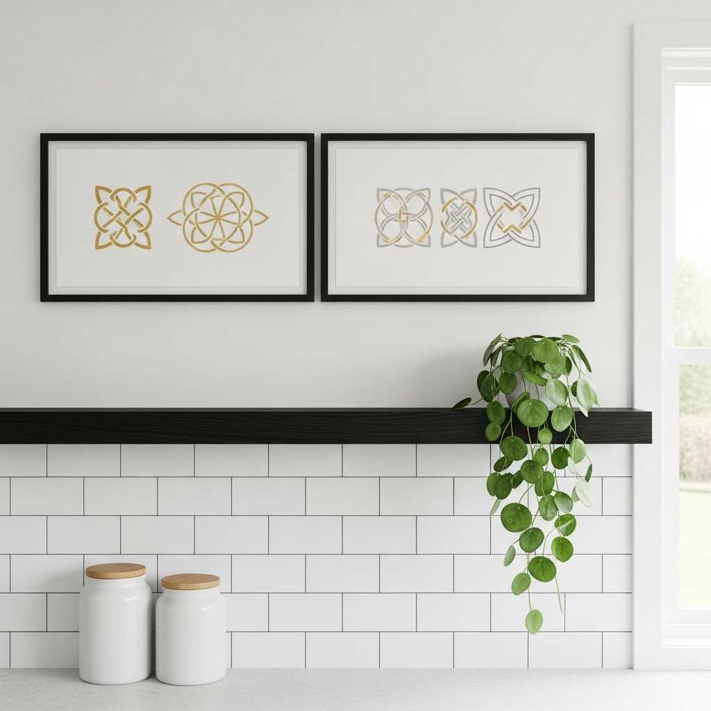
Celtic Knots and Irish-Inspired Geometry
Celtic designs feel perfect for minimalist wall art. They already rely on clean lines and symmetry.
I prefer:
- Simple knot outlines in black or muted green
- Single-symbol prints with lots of negative space
- Geometric interpretations of traditional Irish patterns
These designs feel timeless, not holiday-specific. That means you can enjoy them all year if you want.
Browse Irish-Inspired Minimalist Prints
Typography That Feels Calm, Not Corny
Words can work for St. Patrick’s Day decor, but only if you choose them carefully. Not every quote deserves wall space.
I once hung a loud holiday phrase and regretted it within ten minutes. Lesson learned.
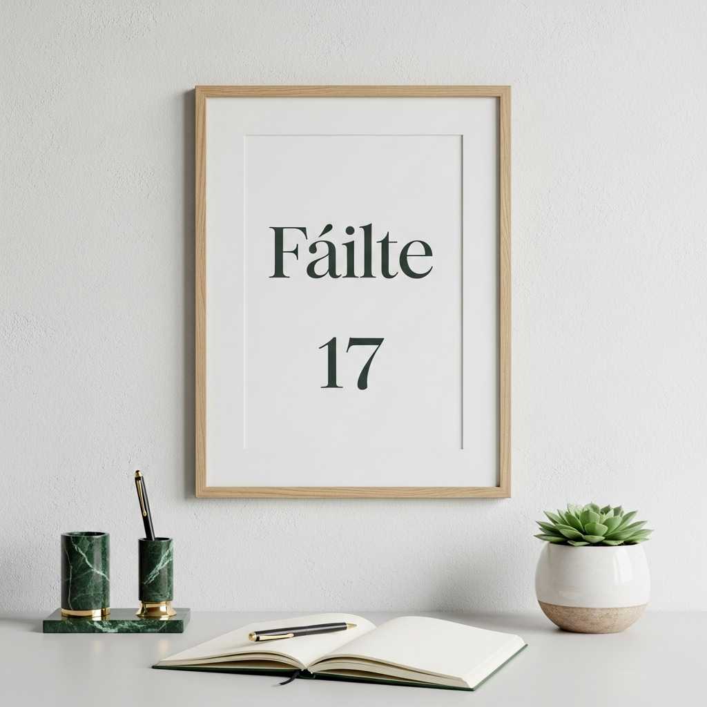
Short Phrases with Meaning
Minimalist typography thrives on brevity. One strong word beats a paragraph every time.
Look for:
- Single-word prints like “Luck” or “Home”
- Short Irish blessings in clean fonts
- Simple serif or sans-serif typography
Keep the design airy and readable. If the font shouts, the message gets lost.
Skip the Obvious Holiday Catchphrases
You already know the ones. They belong on party banners, not walls.
Instead of novelty phrases, choose text that:
- Feels reflective or poetic
- Connects loosely to Irish culture
- Works beyond St. Patrick’s Day
Your future self will thank you when March ends.
Find Minimalist Typography Wall Art
Framing Choices That Elevate the Look
The frame matters almost as much as the art itself. A bad frame can ruin even the most beautiful print.
I like frames that disappear just enough to let the artwork shine.
Simple Frames with Clean Lines
Minimalist wall art pairs best with understated frames.
My go-to options include:
- Thin black metal frames
- Light wood frames with natural grain
- Matte white frames for bright spaces
Avoid heavy ornamentation. Decorative frames fight against minimalism every time.
Matting for Breathing Room
Matting gives art space to exist. It also makes small prints feel intentional.
I usually choose:
- Wide white mats
- Off-white or cream mats for warmer rooms
This extra space adds elegance without adding clutter.
Shop Minimalist Picture Frames
Where to Place Minimalist Wall Art for Maximum Impact
Placement can make or break your decor. One well-placed piece feels intentional. Ten random ones feel chaotic.
I learned to edit aggressively. Less really does look better.
Entryways and Hallways
Your entry sets the tone for your home. A subtle nod to St. Patrick’s Day works perfectly here.
Try:
- One framed print above a console table
- A small gallery of two or three matching pieces
Keep spacing consistent and aligned. Crooked art ruins the calm vibe instantly.
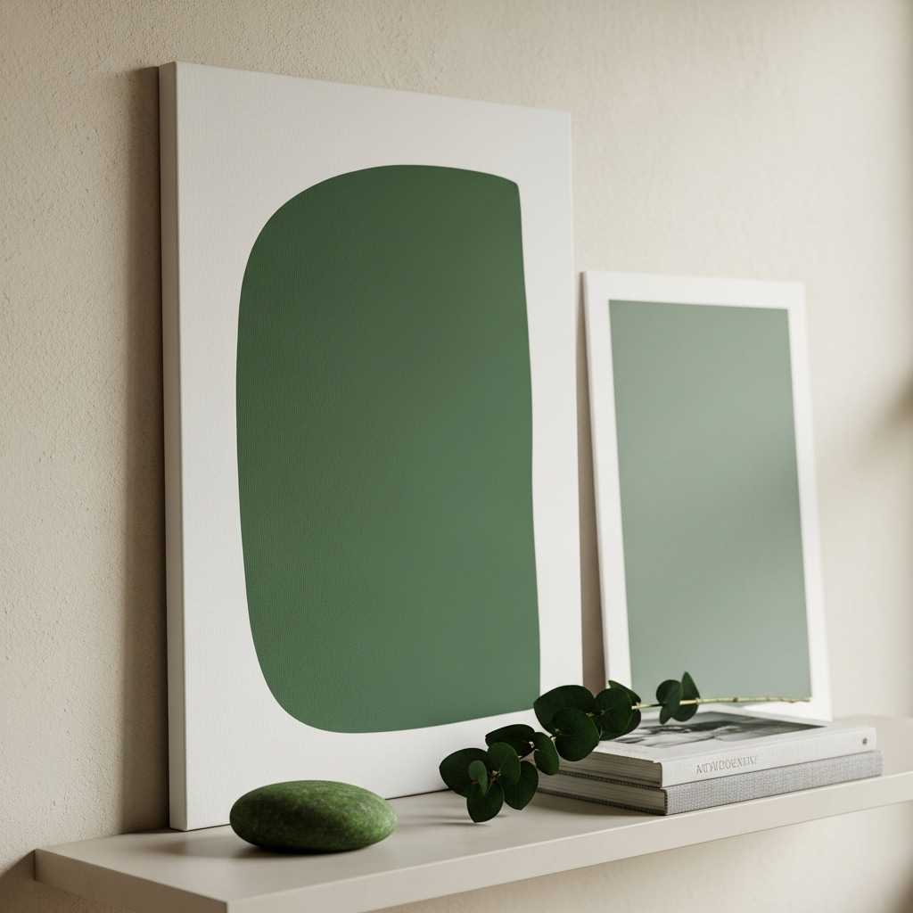
Living Room Accent Walls
You do not need a full gallery wall to make an impact.
I love:
- A single oversized minimalist print
- A pair of symmetrical frames flanking a shelf or mirror
This approach feels curated and calm. Do you see how balance changes everything?
Mixing Seasonal Art with Everyday Decor
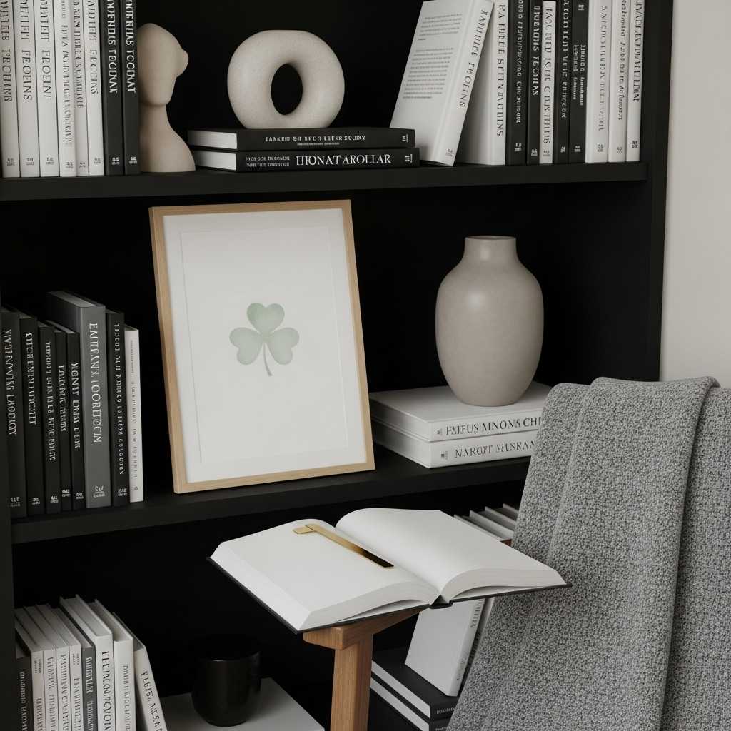
The secret to subtle St. Patrick’s Day decor lies in integration. Seasonal art should blend in, not stand apart.
I always layer rather than replace.
Layering with Existing Pieces
Instead of removing your usual art, try swapping one or two pieces.
This works especially well if your everyday decor already leans neutral or nature-inspired.
You can:
- Replace one print in a gallery wall
- Add a seasonal piece to a shelf or ledge
- Lean art against the wall for a relaxed feel
This method saves time and sanity.
Keeping a Cohesive Style
Stick to your existing design style. Minimalist art should not suddenly turn rustic or boho unless your space already does.
Consistency keeps everything feeling intentional.
Digital Prints vs Physical Art
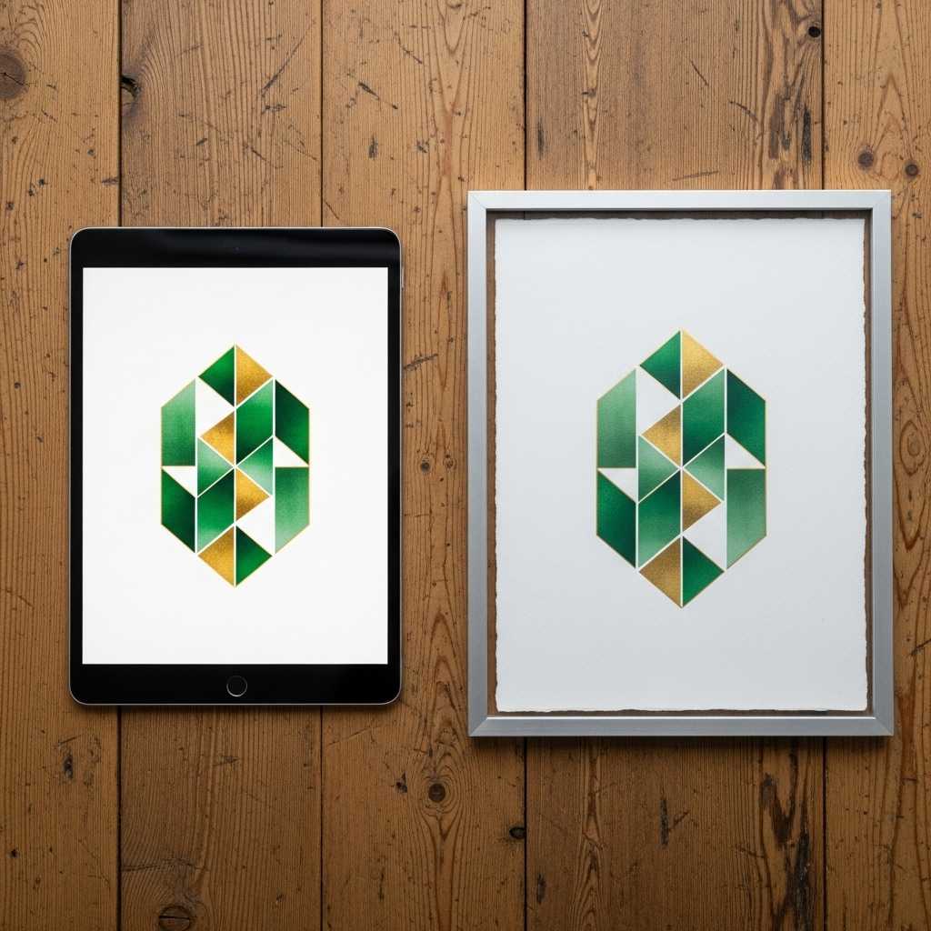
Both options work well, but each comes with its own perks. I use both depending on my mood and budget.
Why Digital Prints Make Sense
Digital prints offer flexibility and affordability.
I love them because:
- You can swap designs easily
- They cost less than original art
- You can customize size and paper
They work great if you enjoy changing decor often.
When Physical Art Feels Worth It
Physical art adds texture and presence. It feels more permanent and grounded.
I choose physical pieces when:
- I want a long-term decor item
- The design feels timeless
- The materials add depth, like canvas or textured paper
Both options can support minimalist St. Patrick’s Day decor beautifully.
Explore Minimalist Wall Art Options
Avoiding Common Mistakes with Minimalist Holiday Decor
Minimalism sounds easy until it is not. A few missteps can ruin the vibe quickly.
I have made all of these mistakes so you do not have to.
Overdoing the Theme
Even minimalist decor can become too much.
Watch out for:
- Too many green accents in one space
- Multiple holiday symbols competing for attention
- Mixing too many art styles
If everything feels seasonal, nothing feels special.
Ignoring Scale and Proportion
Tiny art on a big wall feels lost. Huge art in a small space feels overwhelming.
Measure before you hang. Always.
Proper scale keeps minimalist wall art feeling intentional rather than accidental.
Making Minimalist St. Patrick’s Day Decor Feel Personal
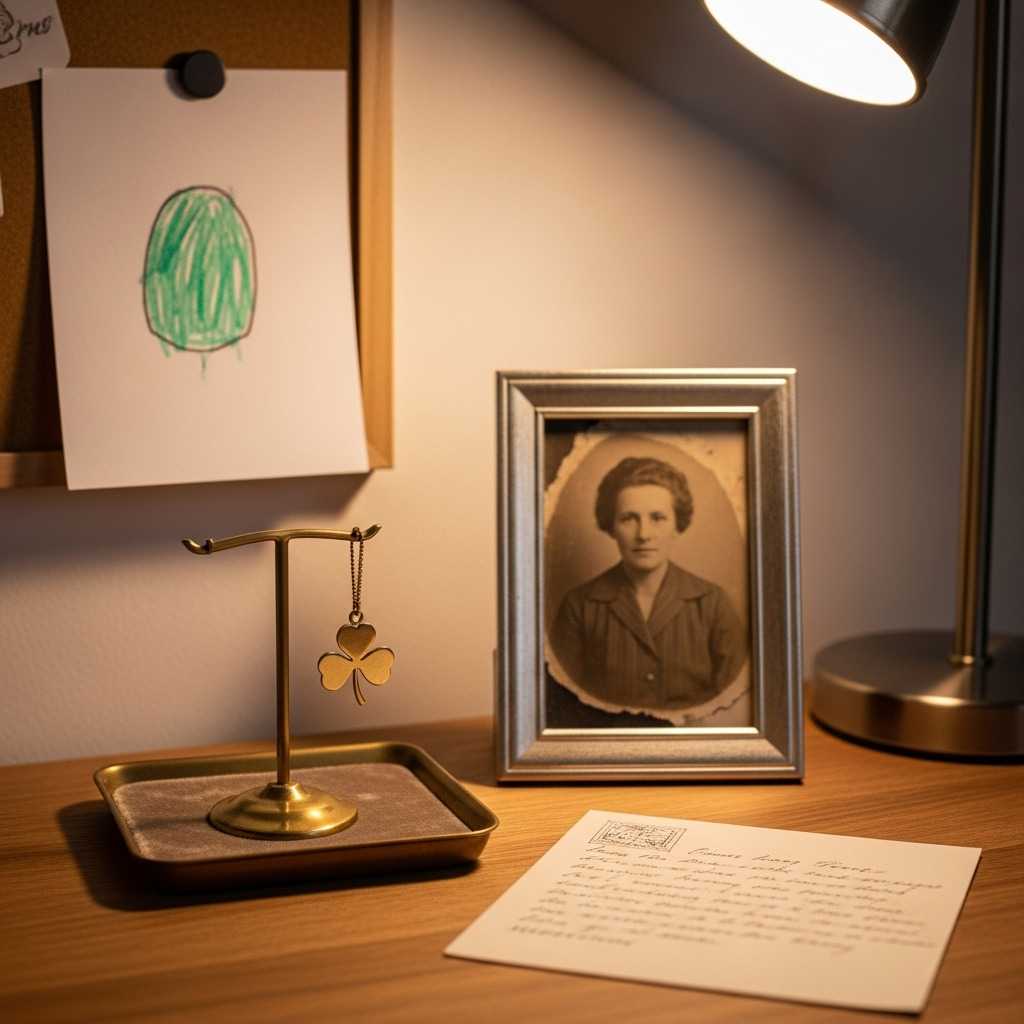
Personal touches turn decor into a story. Without them, even beautiful art can feel cold.
I like adding subtle layers of meaning.
Art That Connects to Your Story
Maybe you have Irish roots. Maybe you just love the culture. Either way, let that guide your choices.
You might choose:
- A map-inspired print
- A quote that resonates personally
- Art that reflects nature you love
Personal meaning always elevates decor.
Rotating Art as a Ritual
I treat seasonal art swaps as a small ritual. It helps me slow down and appreciate the change.
Minimalist wall art makes this process easy and enjoyable.
See Subtle St. Patrick’s Day Wall Art Picks
Final Thoughts on Subtle St. Patrick’s Day Style
Minimalist wall art proves you can celebrate St. Patrick’s Day without sacrificing your aesthetic or your sanity.
Soft greens, clean lines, and thoughtful placement create a festive feel that still respects your space.
You do not need more stuff. You need better choices.
So pick one piece you love, hang it with intention, and enjoy a St. Patrick’s Day that feels calm, stylish, and just festive enough.
If someone asks where all the green went, just smile. You know exactly what you are doing.
What Makes Wall Art Suitable for Minimalist St. Patrick’s Day Decor?
Minimalist wall art is ideal for St. Patrick’s Day. It uses subtle cues instead of obvious holiday images. Soft green tones, abstract shamrocks, or clean Celtic lines create a calm atmosphere.
This style lets you celebrate the holiday while maintaining a balanced space. The art supports the theme quietly, offering a refined and modern touch.
Can Minimalist St. Patrick’s Day Wall Art Work in Small Spaces?
Yes, minimalist wall art works better in small spaces than bold seasonal decor. Clean designs with lots of negative space keep rooms from feeling crowded.
A single framed print or a small pair of coordinated pieces can add seasonal charm without disrupting the room’s flow.
This makes minimalist decor perfect for apartments, hallways, and compact living areas.
What Colors Work Best for Subtle St. Patrick’s Day Wall Art?
Muted greens like sage, olive, and eucalyptus work better than bright emeralds. These shades suggest the holiday while blending well with neutral interiors.
Soft green accents with white, beige, or light gray backgrounds keep the art versatile. This mix feels festive without tying your decor to one season.
Should I Choose Digital Prints or Physical Wall Art for Seasonal Decor?
Digital prints are flexible and convenient. If you enjoy changing your decor often, they’re ideal. You can quickly switch designs without needing extra frames or storage.
Physical wall art adds texture and a sense of permanence. A timeless, minimalist piece can make your decor feel more intentional.
Investing in a physical print gives your seasonal decor a lasting touch.
How Do I Keep St. Patrick’s Day Decor From Looking Overdone?
The key is restraint. Choose one or two seasonal wall art pieces. Let them blend with your everyday decor instead of replacing everything.
Keeping the rest of your space neutral and uncluttered helps minimalist St. Patrick’s Day wall art stand out. This balance stops the decor from feeling too themed or excessive.